
Capsule is a new kind of hybrid digital and physical Pharmacy with a product that allows users to manage their prescriptions within a mobile application. Given they are a startup most of their visual design was built as needed, which lacked consistency. I helped them establish a few visual systems including their first icon system.
My Role — Design Lead
Research, ideation, sketching, art direction, iconography, documentation, training, rollout
The Challenge
Create Capsule’s first icon system to unify all existing one-off icons within our digital products which laddered into the overall brand principles and aesthetic.
Success metric
The system needed to be scalable to work for all future icons and be something the team could reference on their own which enables each designer to work quickly through design iterations.
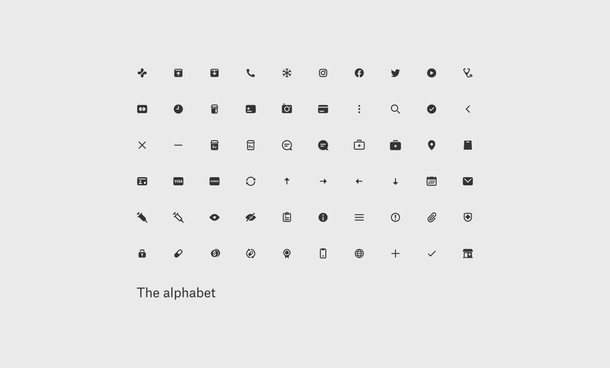
Icon system
As Capsule continued to grow in not only its digital offering but also its national footprint, there was a need to create branding systems that allowed us to quickly scale in a visually cohesive way. Part of this process was to create systems based on the brand which embodied Capsule’s identity pillars. Icons were something that are used in our main product offering but also a handful of other applications. I took the Brand’s Logo Symbol, main font-family, and research from Google and Apple’s systems to develop Capsule’s first icon system. This system was adopted and scaled to each team, and to both current and new product lines.
Results
Successful rollout and Design Team training. Because of this work, I began working on larger projects like the Consumer Design System.
The Team
Head of Design: Martin
Design Lead: Myself
Engineering Leads: JB, Thibault, Adam, Mark

Old icon set examples

Research and Inspiration: Google Material, Apple, Noun Project
Definitions needed: Fill vs. Outline, Angles, Thickness, Corners, Ends, Sizing, Gaps, Grid: padding, guides, and basic shapes.
Brand pillars:
Trustworthy, Warm

Ingredients for icon set: Capsule Logo-mark and brand font
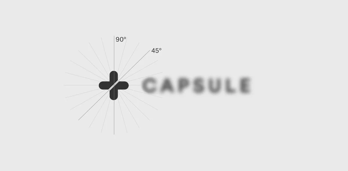
Angles: Degrees of 15 were used for strength, stability, and reliability. What health care should be.

Ends: Rounded like the symbol within the logo mark. Speaks to the warmth health care should offer.

Thickness: Based on the body copy size most icons will live next to. Idea is to make sure they look nice sitting side-by-side.

Gaps: Should not be larger that the strokes unless that adds to the style you are aiming for. I divided the stroke width in half.
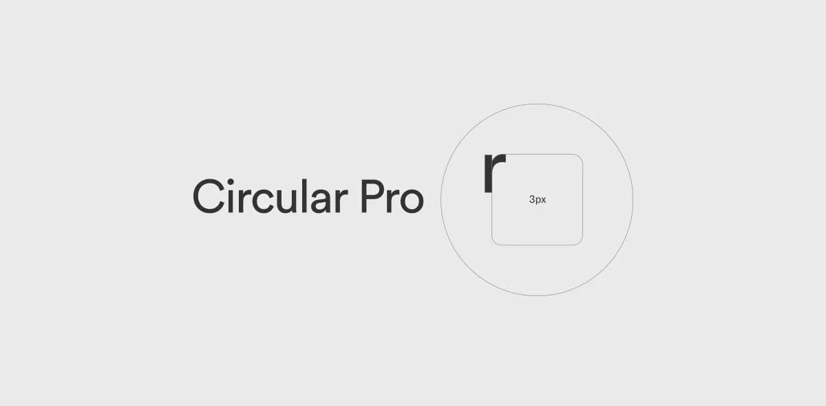
Corners: To add warmth and match other UI elements corners were set to 3px which matched the “r’s” curve and our button corners.
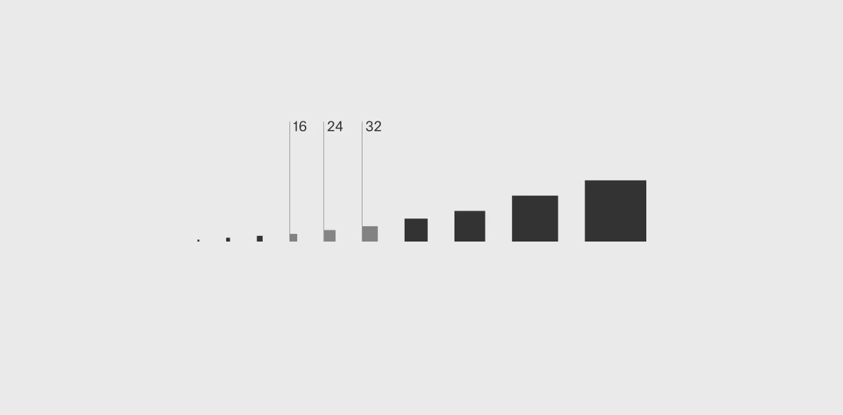
Sizing: Based on the scaling system I defined for our Design System. Common sizes = 16 (dense display), 24 base, 32 large.
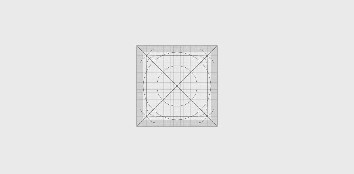
Grid: 1 pixel grid, Basic shapes, Main angles, Thirds, Padding. Helpful for the team to build icons easily.

Exploration examples
Final set: The original set that was finalized. More have been added since.