
SiriusXM, the leading U.S. radio streaming service, offers a suite of connected digital products supported by dedicated design teams. I contributed to unifying their design approach by helping establish the current Atlas Design Foundation and System.
My Role — Lead Product Designer
Research, ideation, sketching, product strategy, facilitation, production, training, and documentation
Background
Upon joining the team, I learned that the company had decided late the previous year to replatform and redesign its digital applications as part of a brand refresh aimed at engaging a younger audience. In Q1, SXM engaged an external agency to explore initial design concepts and inspire the project's overall direction. The timeline for completion and engineering handoff was set for September.
My Challenge
Within three months of joining, I was tasked with developing a design system for their 10-foot platforms, spanning five operating systems, to meet company targets.
Results
Within three months, I consolidated the five operating systems into a single set of standardized design best practices, trained the UX team on 10-foot design, and established a foundation that included 255+ configurable components, feature-specific templates, a sticker sheet, and comprehensive engineering documentation.
The Team
Product: Katie (Senior Product Design Director)
Design support: Artem (mobile D.S.), Laura (eng specs), Salome (D.S. Director), Ryan (Core Design Director), Pep (DNA Player contractor)
Engineering: Josh (Head of Engineering)
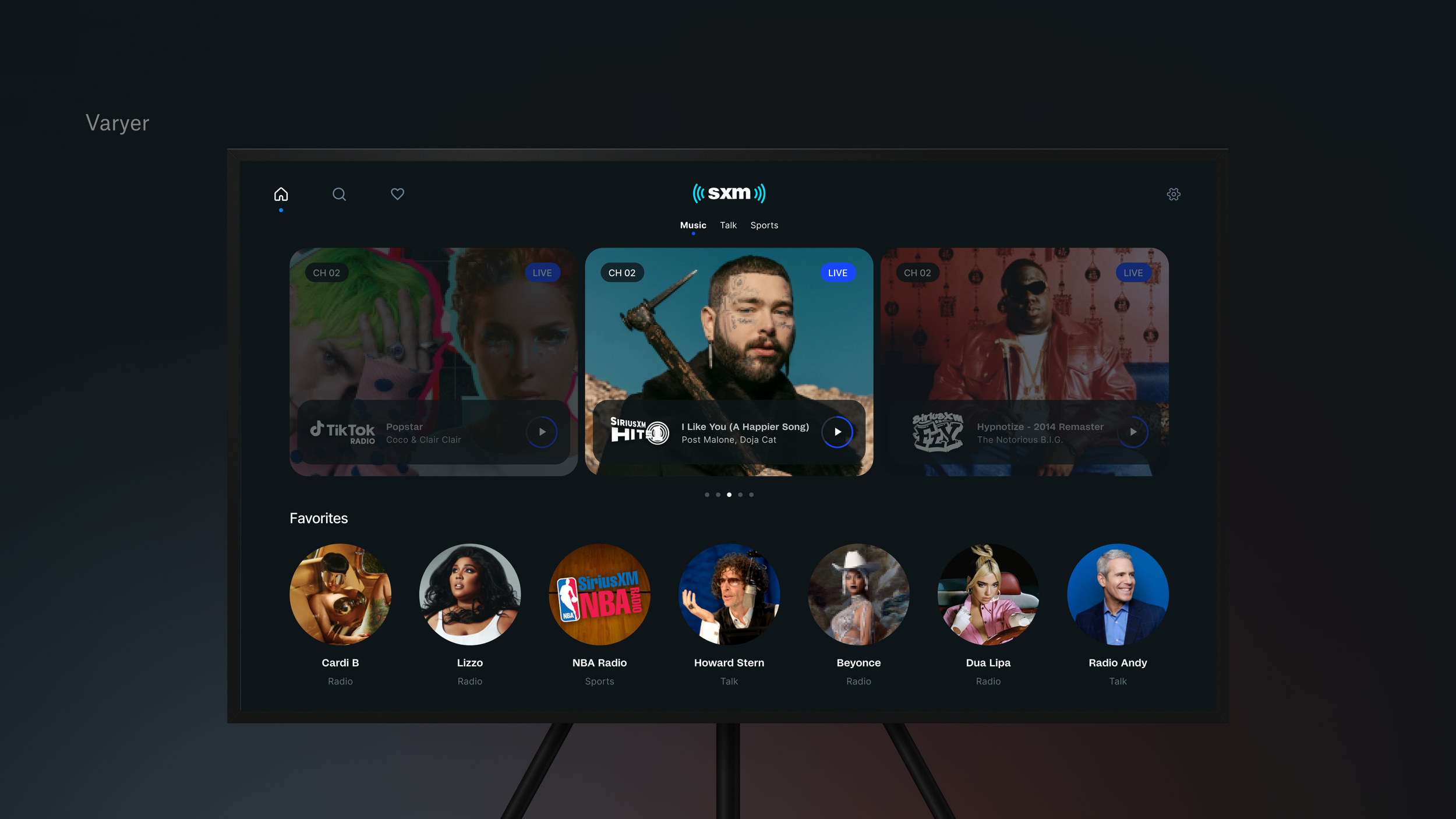
Original explorations by Varyer

Varyer’s exploration wasn’t usable as is and acted as more of a jumping off point
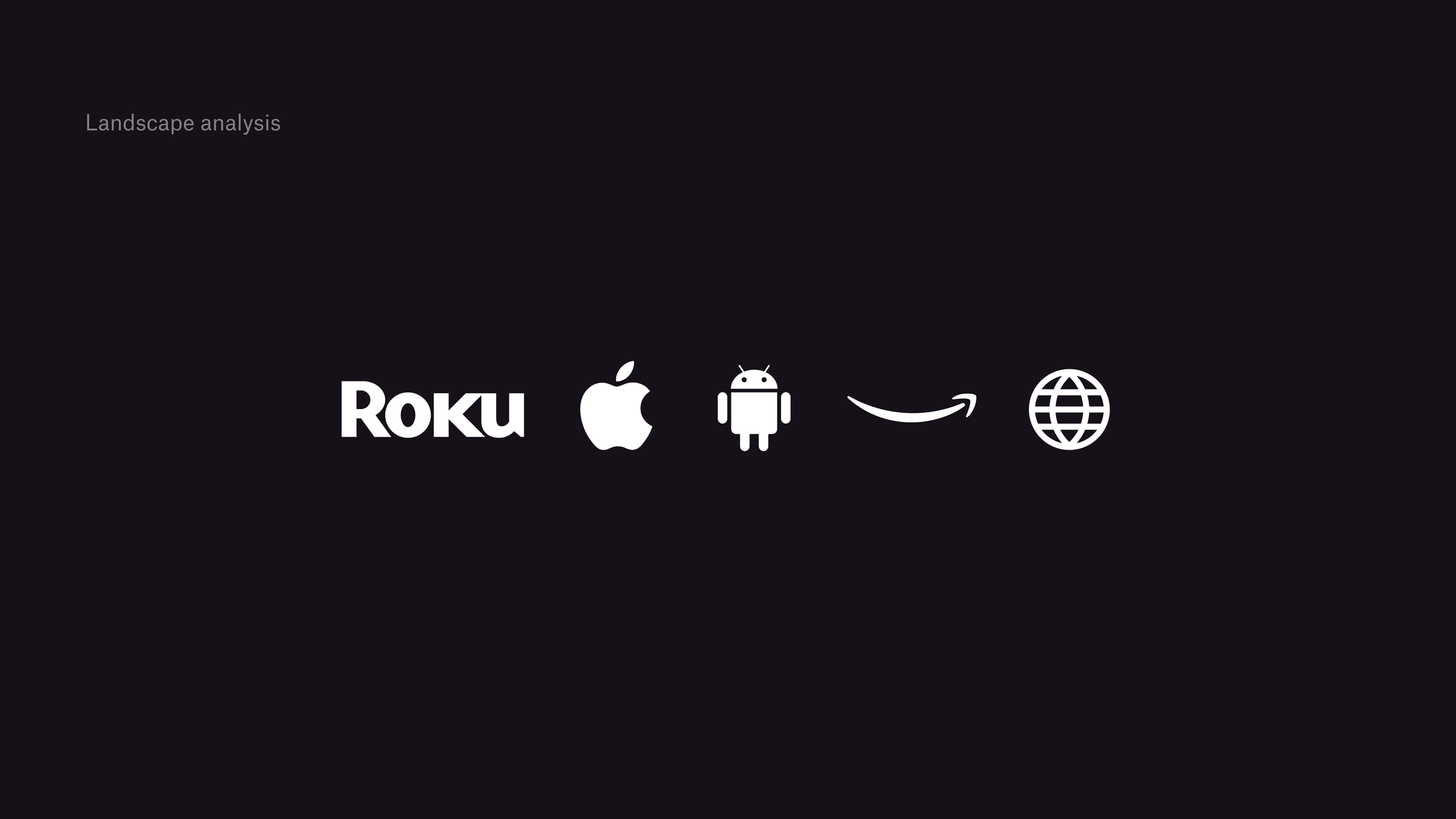
For connected TV’s there are 5 major operating systems

I distilled each OS down to a single set of rules to design for
Consolidated shareable documentation of requirements that satisfy all 5 OS
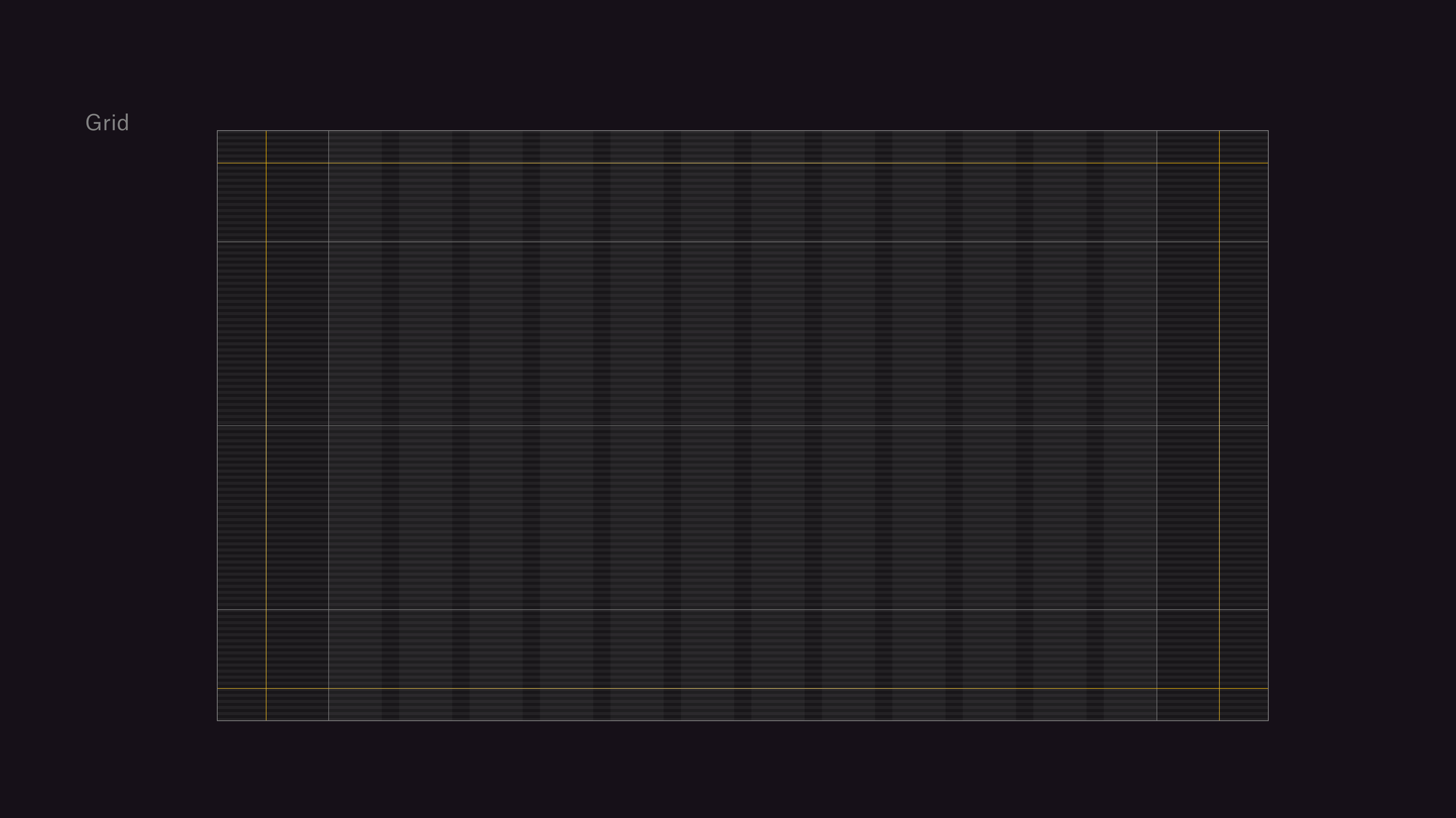
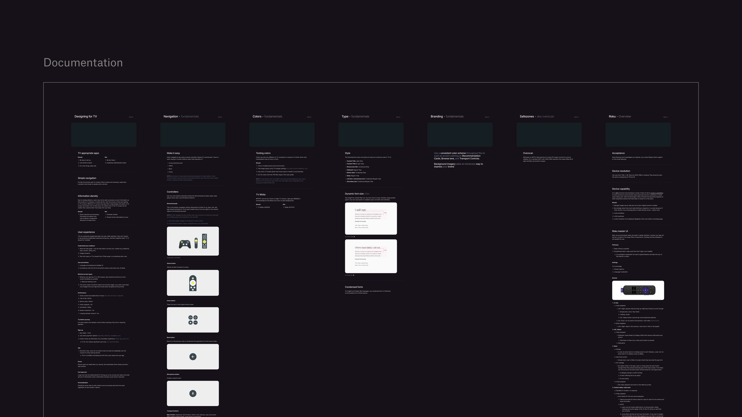
Foundation: Grid system created which incorporates overscan guides, multi-page alignment lines, and a 12 column grid

Foundation: Type based on measurements of well known apps like Spotify, and I pushed for a limited type scale to force consistency, improve eye-tracking, and speed up decision making.

Foundation: using the same scaling system and base-4 system I built out the spacing and sizing system for all elements

Foundation: color palette was produced off of the Varyer explorations. I pushed for a limited palette to account for 10’ focus tracking painpoints
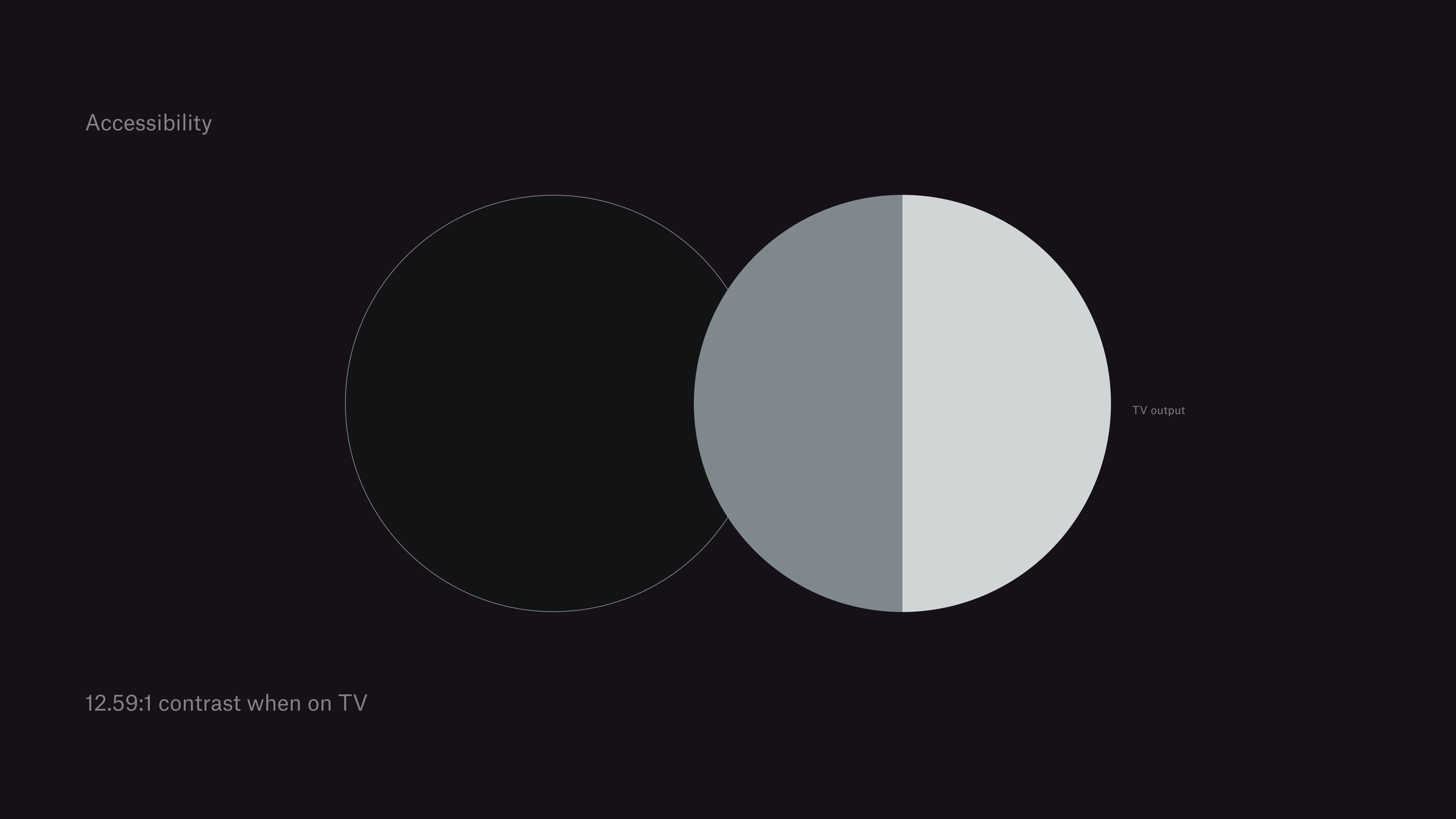
Accessibility: reached a 12:59 contrast rating for TV which helped with viewing even our grey text at a 10’ distance

Navigation: after reviewing standards across systems I established the navigational pattern and different page structures

I then built the component library with sets and props that aligned with other platforms like mobile and web

Created templates of every layout needed for each 10’ feature

Documented the various components and utilized the new Dev Mode feature in Figma to help engineers build faster

Set up the QA lab at the NYC headquarters office

Further helped Eng and QA teams out by redlining releases to show where things did not match the figma files and what expectations were from the Director level